
The 2026 Interior Trends I’m Actually Keeping and the Ones Already Looking Tired
We are more than halfway through 2026, which means we can stop pretending every prediction made in January has become a movement.
Some ideas have earned their place. Others already look like a product launch in search of a lifestyle. Here is what I think is genuinely shaping good rooms this year, what I would keep, and what can quietly leave before it becomes another box in the garage.
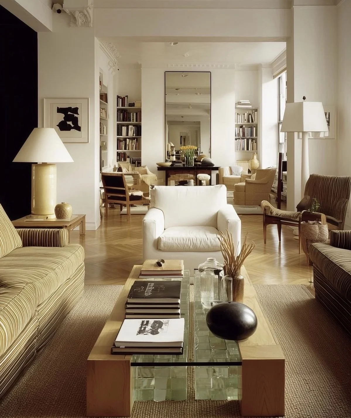
Keeping: rooms that look lived in
The polished showroom room has lost some of its authority. Homes are becoming softer, more personal and less interested in matching every piece.
This does not mean clutter has won. A lived-in room is not one covered in tiny objects and abandoned mugs. It means mixing periods, allowing useful things to remain visible and choosing furniture that supports actual life.
A room should contain evidence of a person, not evidence of a same-day shopping spree.
Keeping: darker timber
Walnut, smoked oak, chocolate and reddish brown timbers are bringing weight back to interiors after years of pale oak everywhere.
I like this shift because dark timber creates contrast. It makes white walls, linen, metal and contemporary upholstery look sharper. It also tends to feel more established than a room where every surface is the same pale beige.
The warning is simple. Do not replace an entire house because the preferred timber changed. Mix tones deliberately and let one lead.
Keeping: furniture with stronger form
The best new rooms are not relying on accessories for personality. The furniture itself is doing more work.
A chair may have a sculptural back. A sofa may be low and generous. A table may have enough scale and material presence to hold the room without a decorative village on top of it.
This suits how I want to live. Fewer objects, better proportion and forms that earn their space.
Keeping: aged and tactile metal
Chrome and stainless steel remain useful, but the broader interest in metal is becoming less shiny and more material. Aged brass, darkened bronze, wrought iron and textured finishes introduce contrast without adding visual clutter.
One metal does not need to appear on every fitting. A lamp, frame or table base can be enough. The point is to add structure, not create a themed hardware package.
Keeping: colour with discipline
Colour is back, apparently, although colour never left homes that understood how to use it.
What feels current is not random brightness. It is deeper, slightly difficult colour: oxblood, tobacco, muddy blue, butter yellow, plum, olive and warm brown. These shades work because they have enough complexity to sit beside timber, stone and older architecture.
I am keeping colour when it builds the room. I am not keeping colour used as a small, purchasable personality kit.
Keeping carefully: decorative textiles
Fringing, piping, checks, stripes, gathered fabric and textile wall pieces are appearing again. Used carefully, they bring craft and softness to rooms that became too smooth.
The key phrase is used carefully. One excellent trim or textile detail can make a simple room feel considered. Applying it to every cushion, curtain and lampshade turns charm into costume.
Already tired: the compulsory curve
Curved furniture is not over. Bad curved furniture is.
A beautiful rounded chair or sofa will remain beautiful. The problem is the bubbly silhouette added to every object because straight lines were declared unfriendly. Some rooms now look as though the furniture has been inflated.
Choose a curve because it improves movement, comfort or contrast. Do not choose it as proof that you have seen the internet.
Already tired: gentle clutter
I understand the response to sterile minimalism, but styling clutter under a softer name does not make it more useful.
Books, bowls, candles, boxes, vases and tiny lamps can all be lovely. They do not all need to appear on the same surface. Personal does not mean permanently full.
A home can be collected and still edited.
Already tired: faux age
There is a growing appetite for patina, rustic wood, worn finishes and objects that appear to carry history. Naturally, retail has responded with brand-new pieces aggressively pretending to be old.
Real age is wonderful. Honest newness is also wonderful. I would rather buy a simple contemporary object than one distressed by a machine to resemble something from an imaginary farmhouse.
Already tired: turning every trend into an aesthetic
Monastic, homespun, romantic, gothic, coastal, heritage and modern heirloom are useful descriptions until they become instructions to purchase an entire identity.
Take the principle that suits you. Leave the costume.
What 2026 is really telling us
The strongest direction this year is not one look. It is a move away from anonymous perfection and towards rooms with material depth, useful furniture and personal judgement.
That is encouraging, but it also asks more of us. You cannot simply buy the approved palette and expect taste to appear. You need to measure, edit, combine and decide.
My 2026 filter remains the same:
• Does it improve the function of the room?
• Is the proportion right?
• Will the material age honestly?
• Does it work with what I already own?
• Would I still like it without the trend name?
If the answer to the last question is no, enjoy the photograph and keep scrolling.
Further reading
Vogue, The 11 Key Interior Design Trends Set to Define 2026: https://www.vogue.com/article/interior-design-trends-2026
Martha Stewart, Home Décor Trends on Their Way Out in 2026: https://www.marthastewart.com/home-decor-trends-out-in-2026-11843646
Shop my current recommendations
For the home and bedroom pieces I am currently using and recommending, visit my ShopMy: https://shopmy.us/louiburke
You can also browse my Amazon Australia storefront: https://www.amazon.com.au/shop/louiburke
These storefronts are updated regularly, so the recommendations stay current.