
Are We Finally Done With Beige? What’s Replacing It in 2026
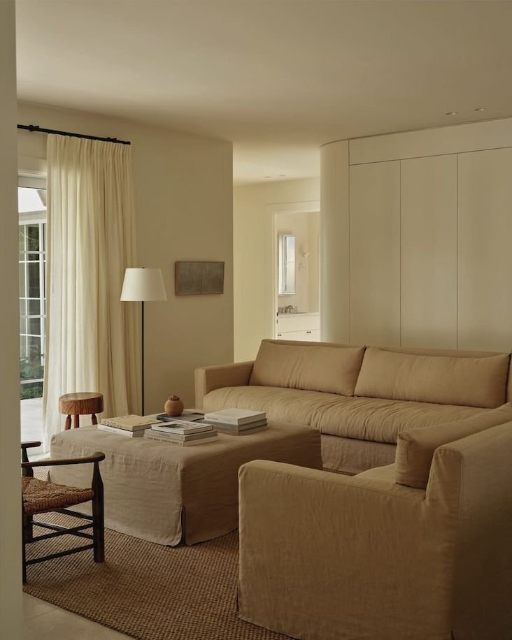
Beige is not dead. It has simply stopped being a complete design concept.
After years of warm white, pale oak, cream boucle and the same softly rounded furniture, interiors are looking for more depth. The change is not a sudden rejection of neutrals. It is a move away from rooms where every surface sits at the same volume.
So what is replacing beige in 2026? Not one colour. Contrast is.
Brown has become the new anchor
Chocolate, tobacco, walnut and reddish timber are giving rooms the weight that pale neutral schemes often lack.
Brown works because it behaves almost like a neutral while still creating a clear line. A chocolate sofa, dark timber table, brown leather chair or tobacco curtain can ground cream walls and lighter floors without forcing the room into a bright palette.
This is not a return to the brown-on-brown interiors of another decade. The strongest rooms use brown beside white, metal, muted colour and natural texture.
Oxblood and burgundy are replacing the tiny red accent
For several years, the unexpected red theory encouraged people to place one small red object in a room and wait for personality to occur.
Deeper reds are more convincing. Oxblood, burgundy and merlot have enough complexity to sit beside timber, stone and aged metal. They feel established rather than novelty-bright.
Use them with scale. A chair, curtain, rug border or substantial artwork will usually look more deliberate than a red tray selected to prove you know the rule.
Muted blue is cooling warm rooms down
Dusty blue, slate, petrol and faded denim tones are appearing as a counterpoint to brown and cream.
Blue is useful because many neutral rooms became excessively warm. A muted version introduces freshness without the sharpness of a bright coastal blue.
Try it in linen, painted joinery, a rug or upholstery. Pair it with warm timber so the room remains balanced rather than chilly.
Butter yellow is bringing light back
Butter yellow has moved through fashion and into interiors because it offers colour without aggression.
In the right room, it can behave like sunlight. It works well on walls, a small sofa, a headboard or linen. It is particularly good with dark brown, soft blue and red.
The risk is treating it as another trend accessory. One butter-yellow object among an otherwise disconnected room will not automatically create warmth. Repeat the undertone or relate it to something larger.
Green is becoming earthier
Sage has been used so widely that it now risks becoming the new greige. The more interesting greens are olive, moss, bottle and muddy celadon.
These shades connect naturally with timber and garden views. They can feel traditional or contemporary depending on the form around them.
I would use green where it makes sense architecturally: joinery, a study, a dining room, upholstery or a substantial curtain. I would avoid distributing small green objects around the house as proof of nature.
Metal is interrupting all the softness
The post-beige room needs something crisp. Stainless steel, chrome, dark bronze and aged brass provide structure against linen, timber and upholstery.
A metal lamp, table, frame or hardware detail can sharpen the room without making it cold. Mixing finishes is fine when there is hierarchy. Let one metal lead and use another as a smaller contrast.
White is becoming useful again
Beige fatigue does not mean every wall needs colour. Clear white can make dark timber, strong furniture and artwork feel more deliberate.
The difference is what sits against it. White walls with pale flooring, cream furniture and no contrast may feel unfinished. White walls with chocolate upholstery, old timber, linen curtains and blackened metal can feel architectural.
White is a background, not a personality.
Pattern is returning in controlled amounts
Checks, stripes, bordered textiles and small traditional motifs are breaking up large neutral surfaces.
This is especially useful in bedrooms and dining rooms, where pattern can appear through a sheet, tablecloth, curtain or upholstered chair. It creates movement without requiring another decorative object.
Choose a pattern that connects the existing colours. Do not introduce six unrelated prints and call the result collected.
What is actually over?
Beige itself is not over. The automatic beige package is.
The pale sofa, pale rug, pale timber coffee table, cream vase, boucle chair and beige artwork became less a palette than a refusal to decide. Those rooms photographed calmly but often felt flat in person.
Keep the pieces you love. Add contrast through one darker material, one genuine colour and a sharper finish. You may not need to replace anything large.
My formula for moving beyond beige
Start with the neutral room you already have, then add:
• one dark anchor
• one muted colour
• one harder material
• one piece with age or visible grain
• enough empty space for those decisions to register
The aim is not to make the room colourful. It is to give it depth.
Beige remains useful. It just needs to return to its proper role as part of the room, not the entire plot.
Further reading
Vogue, These Colors Will Be Everywhere in Interior Design in 2026: https://www.vogue.com/article/color-trends-2026-interior-design
Vogue, How Interior Designers Are Decorating With Red: https://www.vogue.com/article/interior-design-trend-red
Shop my current recommendations
For the home and bedroom pieces I am currently using and recommending, visit my ShopMy: https://shopmy.us/louiburke
You can also browse my Amazon Australia storefront: https://www.amazon.com.au/shop/louiburke
These storefronts are updated regularly, so the recommendations stay current.