
Millennial Grey Isn’t Dead—We Just Replaced It With Beige


By Loui Burke—your friend in home, hosting and put-together living.
Let’s clear something up: green was never “the new millennial grey,” and dopamine décor has not defeated neutral interiors. Trends do not disappear because the internet announces a new aesthetic. They move gradually, react against what came before and then get renamed so we can pretend we invented them.
What actually replaced millennial grey?
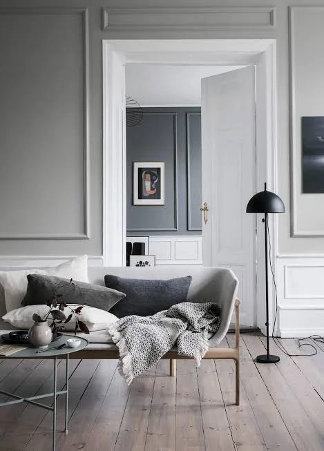
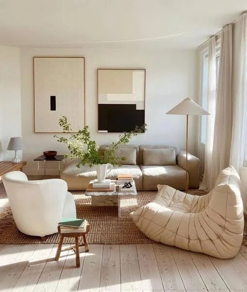
Beige. Not sage green, not cobalt blue and not a room containing seven wavy mirrors. We moved from cool grey to greige, then into cream, mushroom, oatmeal and warm brown. The temperature changed; the appetite for a broadly acceptable neutral did not.
That is how the pendulum works. Cool grey began to feel hard and corporate, so interiors warmed up. Beige offered the same safety with a softer emotional pitch. Eventually beige became so widespread that people began reacting against it too.
Where green fits
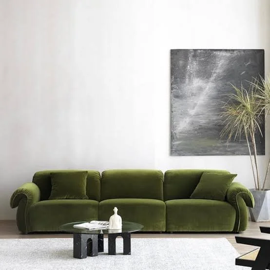
Green had its own cycle: eucalyptus, olive, forest and sage moved through kitchens, velvet sofas, paint and accessories. It was not a universal replacement for grey; it was the dominant accent colour running beside the neutral cycle.
Colour trends often move through neighbouring or opposing families. After years of green, brown created the bridge into warmer rooms. Burgundy and oxblood then arrived as a richer red counterpoint. Green → brown → burgundy is not a law, but it is a much more useful way to understand the shift than declaring one random colour “the new grey.”
And then came dopamine décor
Dopamine décor is partly a genuine embrace of colour and partly an understandable rebellion against years of beige rooms photographed to look identical. Bright colour, pattern and personal objects can absolutely make a home feel alive.
But colour is not a substitute for composition.
A red lamp, checkerboard rug, squiggly mirror and stack of colourful books do not automatically create personality. Sometimes they create visual noise with an excellent publicist. Buying a collection of trend-coded objects is still conformity—it is simply a louder version.
Why colourful rooms cost more than people expect
Mass retailers produce neutral furniture because it appeals to the widest audience and carries less inventory risk. More specific colours and finishes are made in smaller quantities, which often makes them harder to find and more expensive.
This is why a genuinely resolved colourful interior usually requires more patience than buying the first beige sofa, rug and dining chair available. Colour demands decisions: which shade leads, which repeats, what stays quiet and where the eye is meant to rest.
Is dopamine décor here to stay?
Colour will stay. The label will not. The strongest colourful homes existed before the phrase and will survive after it because they are built on proportion, rhythm, contrast and personal reference—not a shopping list of viral objects.
The weaker version will date quickly because chaos was the entire idea. If every item is the joke, there is no room left for the room.
So what should you actually do?
Use colour if you love colour. Use neutrals if they make you feel calm. But stop asking a trend to do the work of taste.
Clean gives calm. Style gives warmth. Restraint gives taste. Function gives meaning. Those principles can produce a burgundy room, a cream room or a room painted entirely blue. What makes it feel put together is not the current colour forecast; it is the quality of the decisions.
Millennial grey did not die. It warmed into beige. Dopamine décor did not take over. It simply became louder online. And eventually the pendulum will move again—because it always does.